Infographics are powerful tools in the digital age. Whether you’re presenting complex information, summarizing data, or trying to boost your social media engagement, infographics help make your content more digestible, memorable, and visually appealing. But what if you don’t have access to professional design software like Adobe Illustrator or Canva Pro?
Believe it or not, you can create infographics using Microsoft Word. Yes, the same software you use for essays and reports can be transformed into a visual content design tool. In this article, we’ll walk through how to create infographics in Word step by step. We’ll also talk about when Word might fall short—and how tools like an AI infographic generator such as VDraw can help you scale your visual content faster and more efficiently.

1. Why Infographics Matter in 2025
Information overload is real. Whether you're reading reports at work, scrolling social media, or trying to digest academic material, you’re bombarded with content. That’s why visual communication is more important than ever.
Infographics combine text, data, and imagery to convey key ideas in a visually engaging way. Studies show that visuals are processed 60,000 times faster than text, and users retain 80% of what they see compared to just 20% of what they read. That makes infographics a must-have for any kind of communication strategy—be it educational, professional, or personal.
2. Common Use Cases for Infographics

Infographics are not just for marketing agencies. Here’s where people use them:
- Educators-use them to break down complex topics like historical events, scientific processes, or data interpretation.
- Marketers-use them to explain services, compare products, or show customer journeys.
-
Students-use them in presentations or thesis summaries.
Nonprofits-use them for impact reports and awareness campaigns. - Businesses-use them for internal communication, training materials, and reports.
3. How to Create Infographics in Word
Microsoft Word might not be the first tool you think of for design, but it actually offers enough features to create decent infographics—especially for beginners. Let's learn how to create an infographic in word.
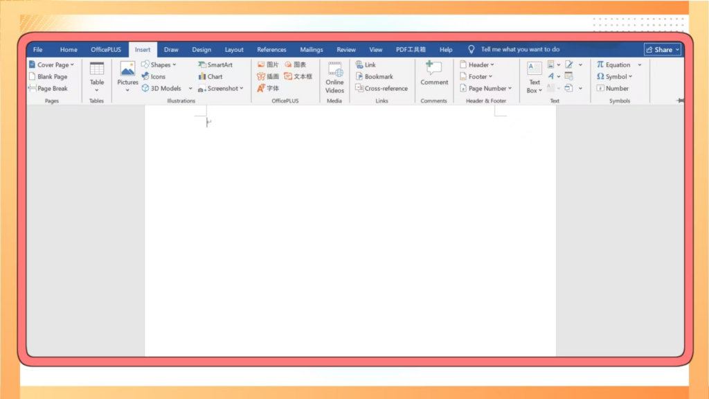
Step 1: Start with a Blank Document
Open Word and create a new blank document. For infographics, it’s best to switch the page layout to Landscape (go to Layout > Orientation > Landscape). This gives you more horizontal space to design your visual.
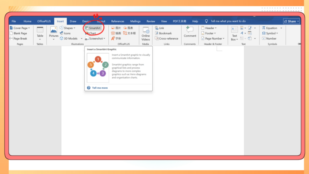
Step 2: Use SmartArt for Layouts
Go to Insert > SmartArt. This brings up a gallery of layout types—processes, cycles, pyramids, and more. Choose one that fits your content structure. SmartArt lets you easily input text and auto-adjusts the shapes to keep everything clean and aligned.
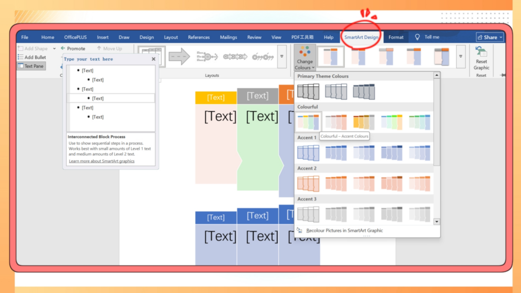
Step 3: Customize the Look
You can edit fonts, colors, and styles using the 'SmartArt Design' and 'Format' tabs. Don’t forget to match your color palette to your brand identity if you're making content for social media or business.
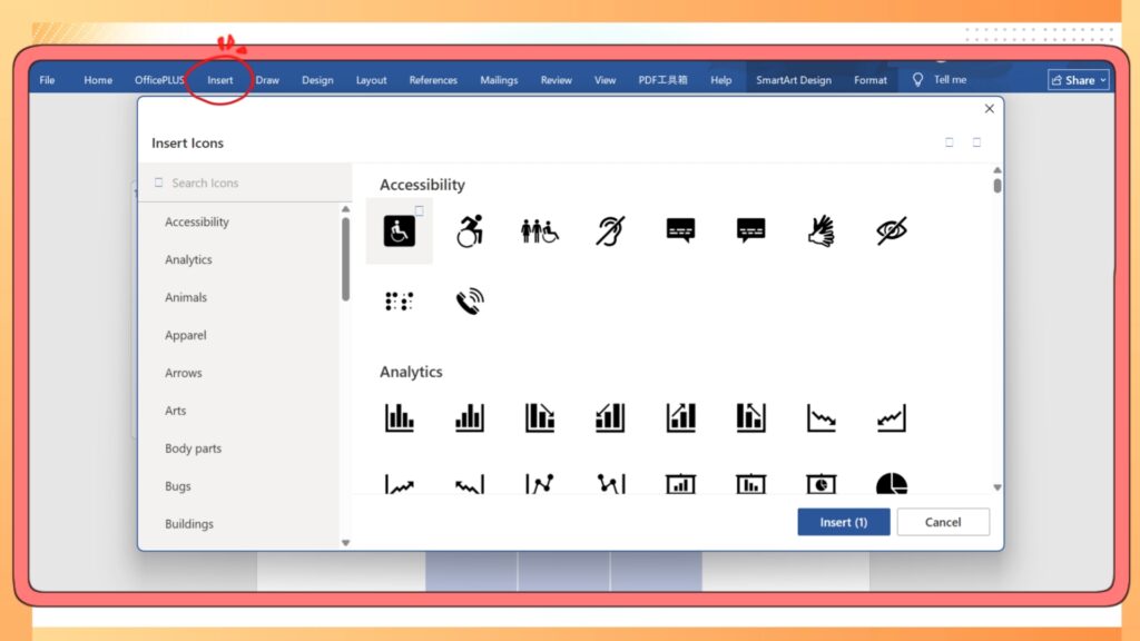
Step 4: Add Charts and Icons
For data-driven visuals, go to Insert > Chart. Word supports various charts like bar graphs, pie charts, and line graphs. Use them to visualize key metrics or comparisons.
To include icons, you can either use Word's built-in icon library (Insert > Icons) or add your own PNG/SVG images.
Step 5: Use Shapes and Text Boxes
Sometimes SmartArt isn’t flexible enough. In that case, manually insert shapes and text boxes. Use the alignment and grouping tools to keep your design organized and symmetrical.
Step 6: Final Touches and Export
Once everything looks polished, save your document. You can export it as a PDF or use a screen capture tool to save the infographic as an image for sharing on social platforms.
4. Downsides of Using Word for Infographics
While Word is accessible, it’s far from perfect. Here are some of the limitations:
- Limited Templates: Word provides minimal templates with basic styles, restricting creativity and modern aesthetics.
- Time-Consuming Manual Adjustments: All elements must be manually positioned and resized, often leading to messy layouts and increased production time.
- Difficult High-Resolution Exports: Word struggles to produce high-quality images suitable for printing or high-resolution displays.
- Outdated Design Capabilities: Word's design elements can appear outdated and monotonous, lacking appeal to contemporary audiences.
- Poor Mobile Optimization: Infographics created in Word often display poorly on mobile devices, compromising readability and user experience.
5. Why Switch to an AI Infographic Generator
When you need stunning visuals fast, an ai infographic generator is the way to go. These tools use machine learning to interpret your content and instantly convert it into professionally designed graphics.
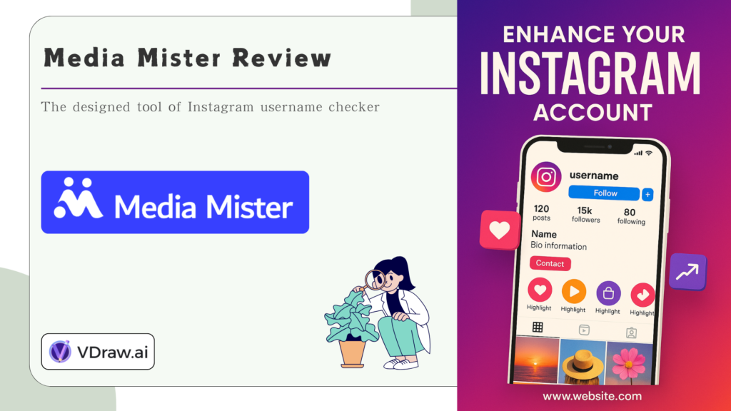
VDraw,for example, helps you go from text to visual in seconds. Just enter your topic, key points, or data, and the AI generates a clean, branded infographic.
Advantages of using an ai infographic generator like VDraw include:
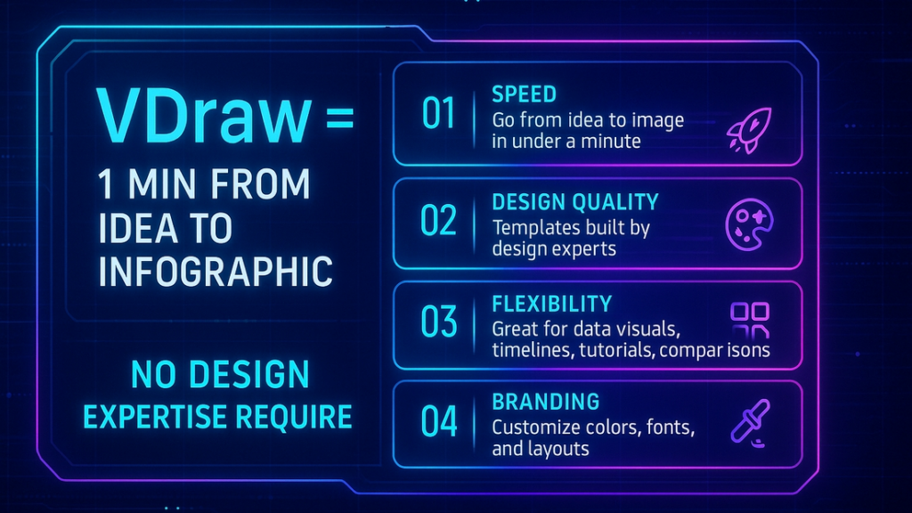
Speed: Go from idea to image in under a minute.
Design quality: Templates built by design experts.
Flexibility: Great for data visual, timelines, tutorials, comparisons, and more.
Branding: Customize colors, fonts, and layouts.
Accessibility: No need for graphic design training or software.
6. How to Use VDraw in Your Workflow
If you’re ready to try an AI solution, here’s how to use VDraw AI Infographic Generator
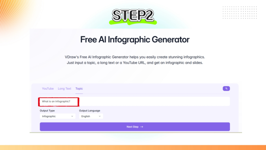
Step 1. Go to the site and choose the AI Infographic Generator tool.
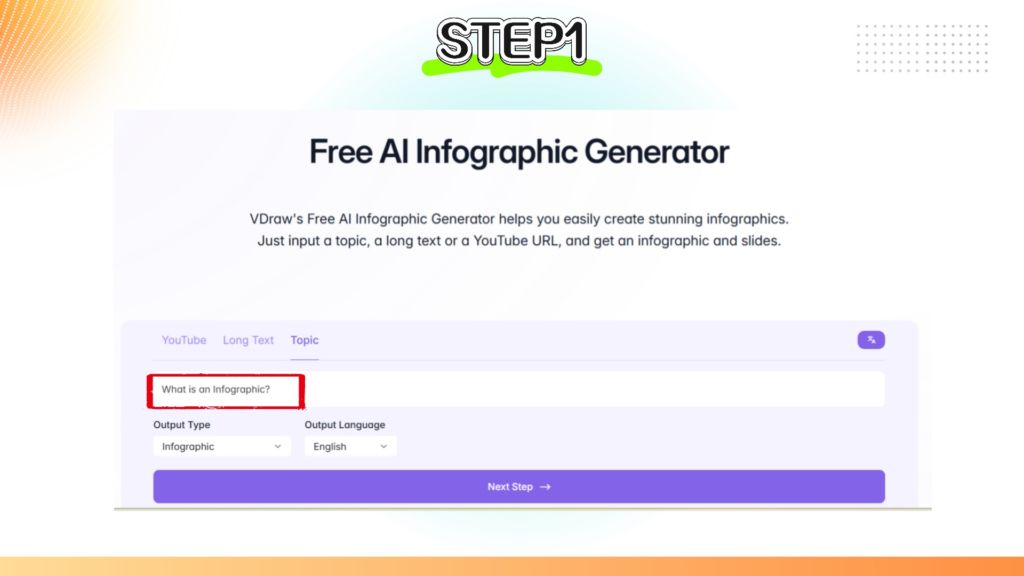
Step 2. Enter your topic, list of points, or raw data.
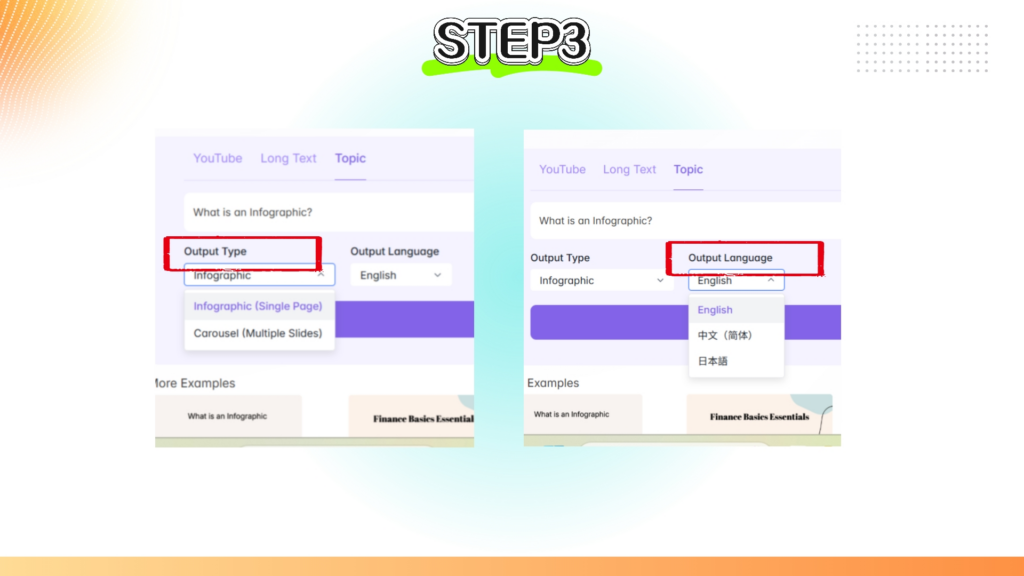
Step 3. Choose your preferred format—Output Type and Language.
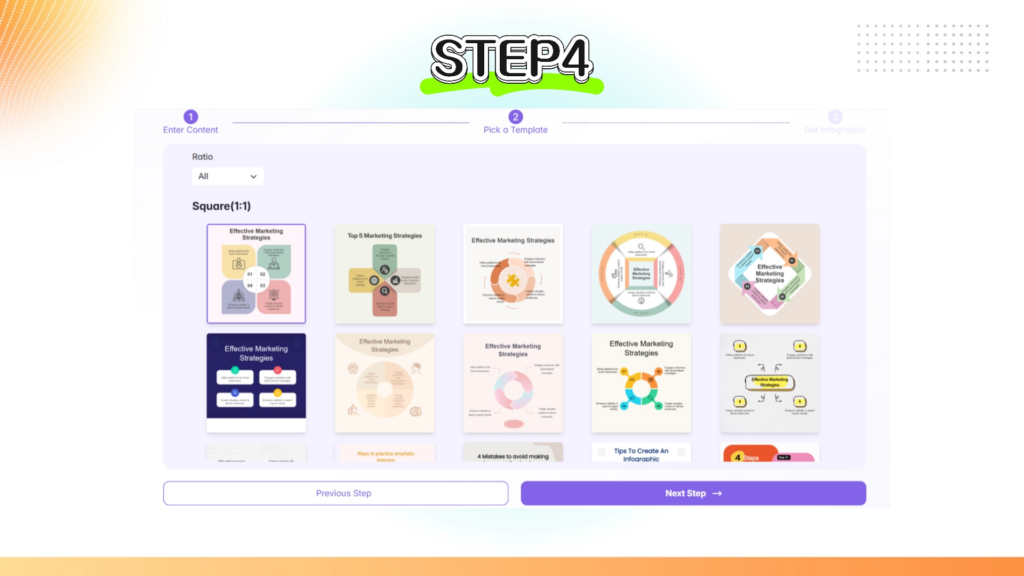
Step 4. Pick your preferred template
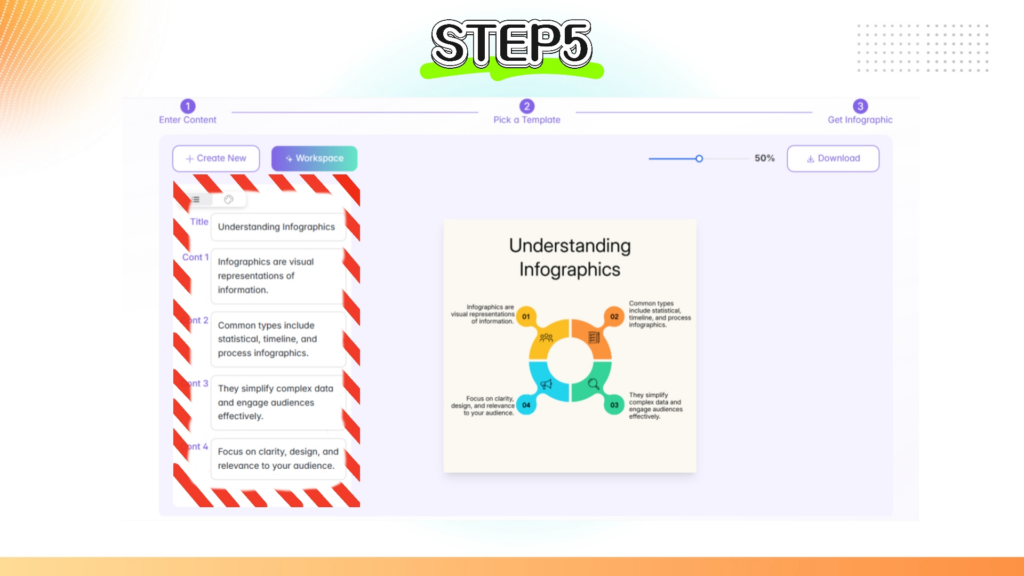
Step 5. Now review the generated text — everything can be edited
7. Word vs. VDraw
Creating infographics in Word is possible, and for simple projects, it may be all you need. But if you want modern, dynamic, and brand-ready visuals without the hassle of design, then an ai infographic generator is the clear winner.
Tools like VDraw save time, boost quality, and help your content perform better across all channels. Whether you're in education, marketing, or small business, it's worth making the switch.
If you’re still unsure whether to stick with Word or try an AI-powered alternative, here’s a direct comparison of how the two tools measure up:
| Feature | Microsoft Word | VDraw |
| Ease of Use | Easy to start but manual layout needed | Extremely simple with automatic generation |
| Template Variety | Basic SmartArt templates only | Diverse modern and dynamic templates |
| Chart & Data Support | Limited and manual | Smart data rendering and visualizations |
| Export Quality | Manual, resolution not easily controlled | High-resolution export optimized for all uses |
| Social Media Optimization | Not optimized | Ready for platforms like Instagram, LinkedIn |
| Brand Consistency | Manual effort needed each time | Supports brand fonts, colors, and layout settings |
8. Design Best Practices for Infographics
Even the best tools can’t fix a poorly structured visual. From a professional designer’s perspective, crafting a high-impact infographic requires more than filling out a template. Here are essential best practices that apply whether you're designing in Word or using an AI infographic generator like VDraw.
1. Keep it Focused
One infographic should convey one main idea. Overloading your design with too many facts or mixed topics confuses the viewer and dilutes your message. Use one clear headline, and break down your content into sections with bold headers.
2. Use a Consistent Visual Style
Design consistency across your fonts, colors, icon styles, and spacing improves readability and brand recognition. Stick to 2-3 fonts and limit your color palette to primary, secondary, and one accent color. VDraw allows you to set brand kits to maintain consistency automatically.
3. Use White Space Wisely
Cramming too much information into tight spaces can make the graphic look cluttered. Allow breathing room around text blocks and icons—this increases legibility and aesthetic appeal.
4. Use Hierarchy to Guide the Eye
Visual hierarchy tells the viewer where to look first. Use large headings, bold section titles, and decreasing font sizes to structure the flow. Highlight critical numbers or statistics with larger fonts or different colors.
5. Use Icons Thoughtfully
Icons are powerful, but only if used meaningfully. Avoid using icons just to fill space. Instead, choose icons that reinforce your points and align with your overall style.
6. Prioritize Readability Across Devices
If your infographic will be shared online, make sure it’s legible on mobile. Avoid font sizes smaller than 12pt and test how your layout scales on narrow screens. Tools like VDraw generate mobile-optimized outputs by default.
9. Conclusion
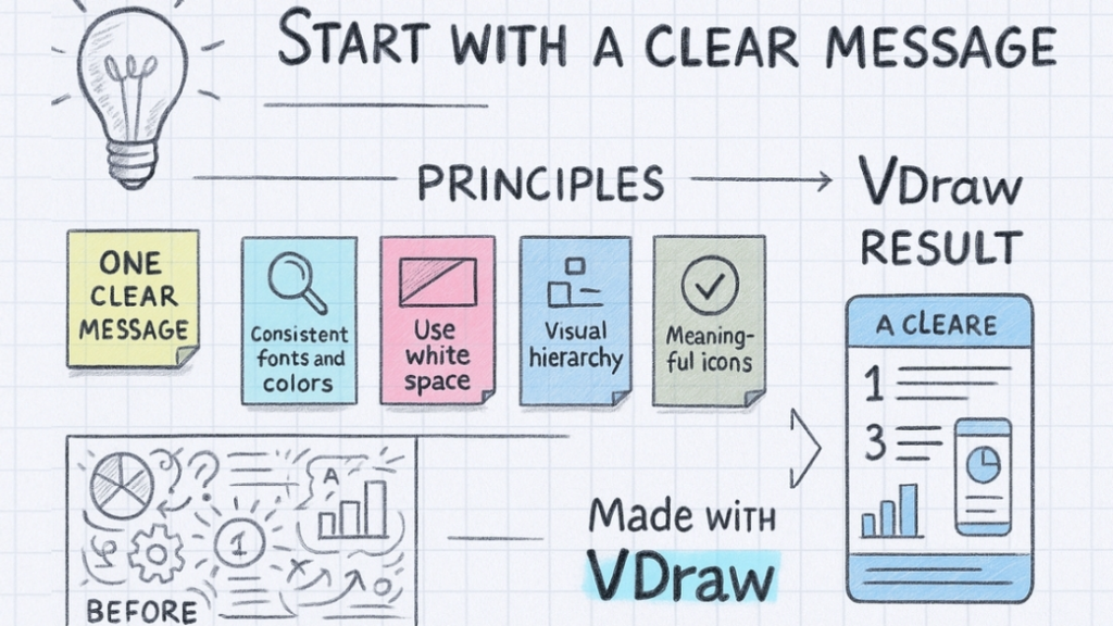
From a designer’s everyday perspective, making a great infographic is kind of like telling a good story—you want one clear message, and you don’t want to confuse your audience with too much going on. Stick to one main idea and make sure everything in the design supports it.
Keep your fonts and colors consistent so it doesn’t look like five different people worked on it. White space is your friend—it helps your content breathe and keeps things from looking crowded. A solid visual hierarchy (like bigger titles, bold subtitles, smaller text) leads your viewer’s eyes exactly where you want them to go.
Pick icons that actually mean something—don’t just toss in random graphics. And don’t forget about mobile users! If someone can’t read your infographic on their phone, they’ll probably just scroll past it.
And if you want to save time while still getting beautiful, well-structured results—give VDraw a try. Your visuals will thank you.